Primary Focus: Mastering Figma
Secondary focus: Improve my visual UI design skills
Design Tools: Figma
Time Frame: 1-3 hours/design
Project Description
While looking for a new job back in 2019, I quickly realized I could use my time a lot wiser if I would continue to hone my skills and potentially learn new things. This is why I decided to start the Daily UI challenge.
My goals for this challenge were to master Figma and bring my UI skills to the next level.
Challenges Days 1-5
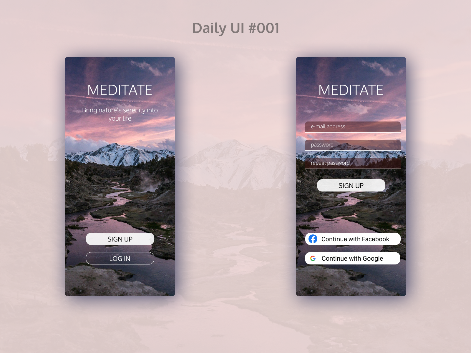
Daily UI #001
I wanted to create something visually appealing with a powerful visual which I have never done before. To experiment, I decided to create a design with an image in the background
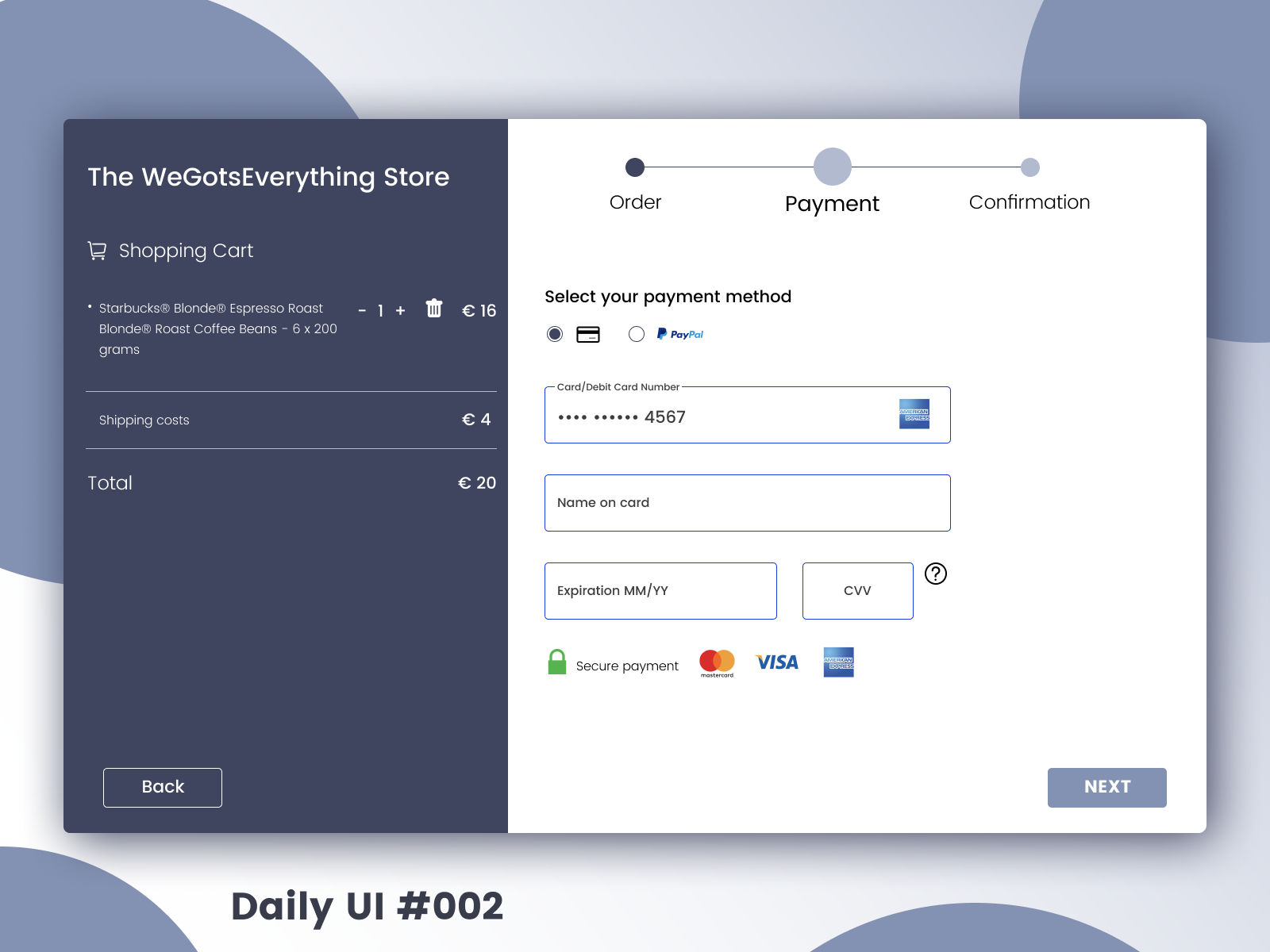
Daily UI #002
The challenge for day two, was to create an e-commerce experience.
My goal with this design was two fold. First, I wanted to make sure that the hierarchy was clear so that the immense amount of information on the page is clearly legible to the user.
My second goal focused making the design presentable. This drove me to pay close attention to the colour scheme and background behind the actual design solution.
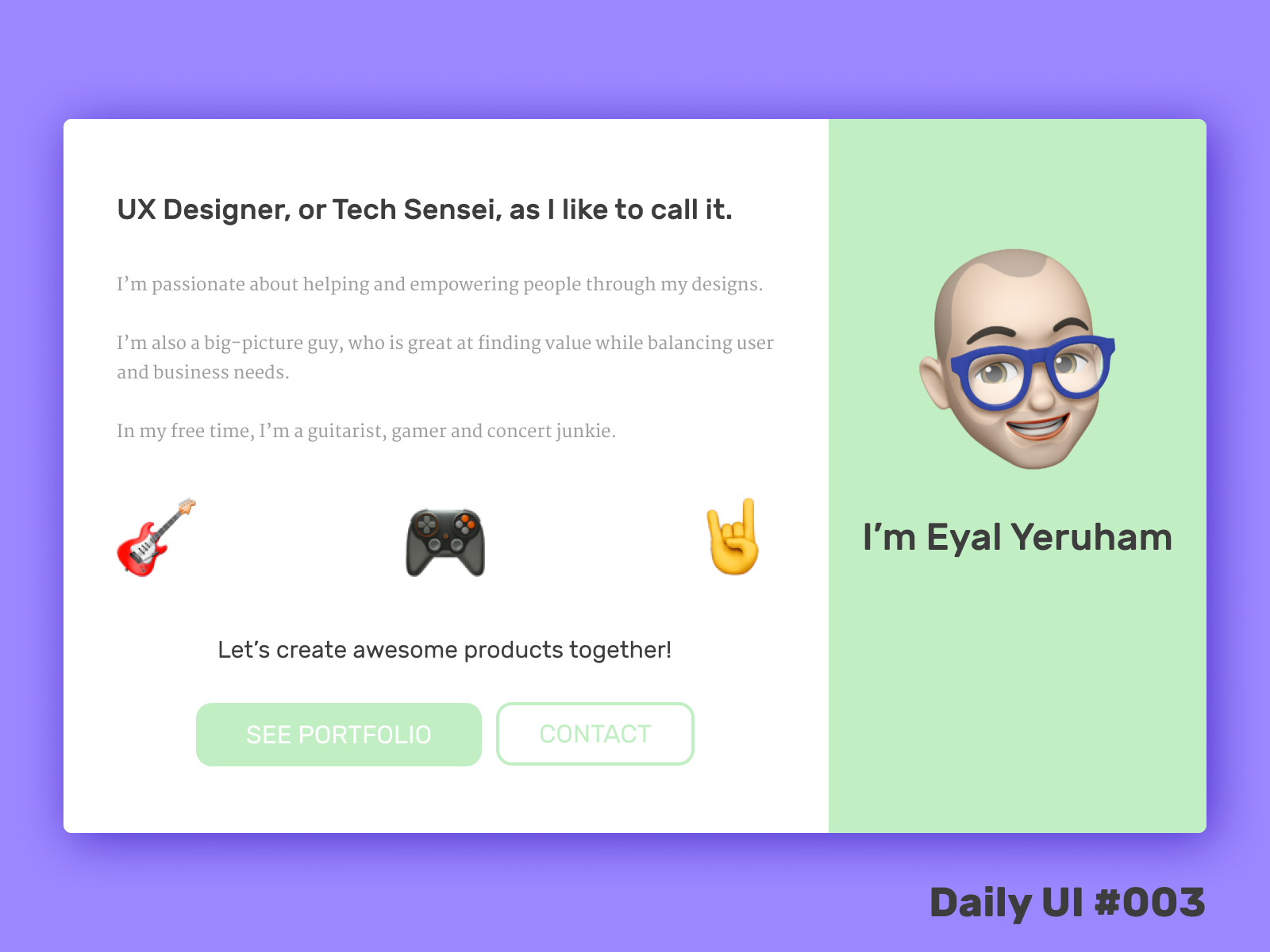
Daily UI #003
The challenge of the third day was a landing page.
I decided to create a landing page for my portfolio website that reflected my personality as best as possible.
The goals of my landing page are:
• Provide a clear overview of who I am & what motivates me
• Bring in users to my website
• Bring in users to my website
The main action in my opinion for a portfolio website should be to see previous work and the secondary would be to get in contact, taking users to a contact page/form.
I gave extra attention to my font choices, as I noticed in the first two designs that it's the aspect I can improve most on.
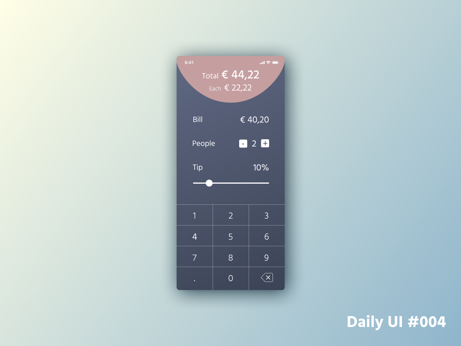
Daily UI #004
Day 4 challenge was a calculator. I decided to go for a tip calculator and wanted to try to create something inspired by dark mode.
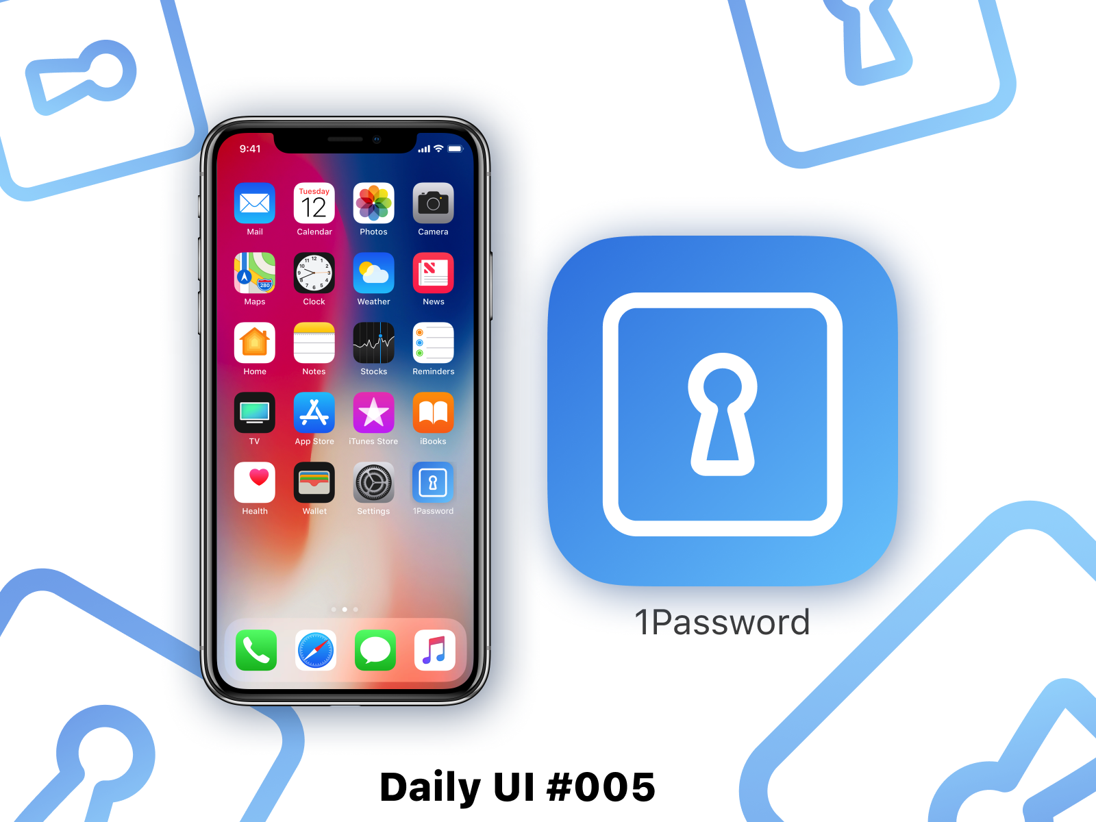
Daily UI #005
As part of day 5 of the Daily UI Challenge, I decided to redesign the 1Password icon.
The app has gone through redesign lately, but the icon stayed the same which made it feel outdated to me.
I took inspiration from the Instagram icon, boiling down the app to its bare essentials and adding some flair to it.