

TL;DR
In this B2C project on iOS, I worked as a Lead UX Designer in a Product Development team comprised of; a product owner, three ios developers and two backend developers. I led user research through conducting data analysis and review sentiment analysis. Throughout the process, I used Figma and Figjam for designing and facilitating design critique sessions. Using ProtoPie, I created prototypes with refined animations and interaction design. With this initiative, I have successfully contributed to an increase of +97,6% to the desired location change origin and with that an indirect increase to app engagement.
Challenge
I identified that app engagement has been steadily dropping through review sentiment analysis, which I conducted
I discovered that users found the app increasingly challenging to use
Based on these insights, I proposed and led a project aimed at improving usability, with the assumption that it would lead to increase in engagement
Starting Point

Identifying Focus
I conducted a quick path exploration analysis to identify the project’s focus. My analysis revealed that the most popular user action, comprising 30.5% of user actions, was changing locations after opening the app. This insight directed our focus towards enhancing the usability of this feature.
The data also indicated that most users consume the information they're looking for from the main home page by switching locations rather than being interested in the detailed information per location.
0,1% of users who changed location opened the detailed weather report.

There were two ways to swap between locations. The first was by clicking on the Search icon in the top left, the second was by swiping on the screen.
After diving into the data and considering that the issue we are trying to address is the drop in app engagement, I opted to focus on improving the affordability of swapping between locations.
Defining KPIs
To ensure we could measure the performance of our changes, I collaborated with the team and stakeholders to define the following KPIs:
Main KPI
Ratio between the two location change origins
Secondary KPI
Increase engagement
Design Process
Competitor/Market leader analysis
Further data analysis
Review sentiment analysis
Design critique session
Stakeholder input session
Design solution
Data Analysis & Review Sentiment Analysis
With the current climate changes, people are relying on weather apps more than ever. Regardless, weather is of course a seasonal thing across the whole world. Therefore I analysed a full year's worth of data, to account for this seasonality.
The marketing team has also created two personas for the app, therefore I also accounted for the difference in personas. We however didn’t find the differences between genders big enough to warrant additional qualitative research to better understand behavioural differences for this specific challenge.

57% location swap from the side menu
43% change location by swiping
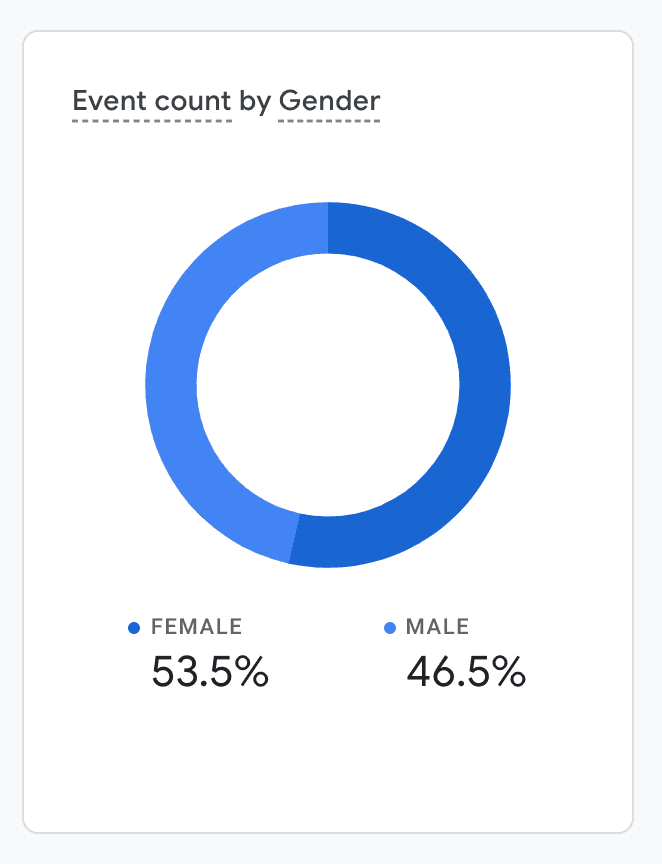
Linda is more likely to track multiple locations than Michael
On average, users track 2 locations
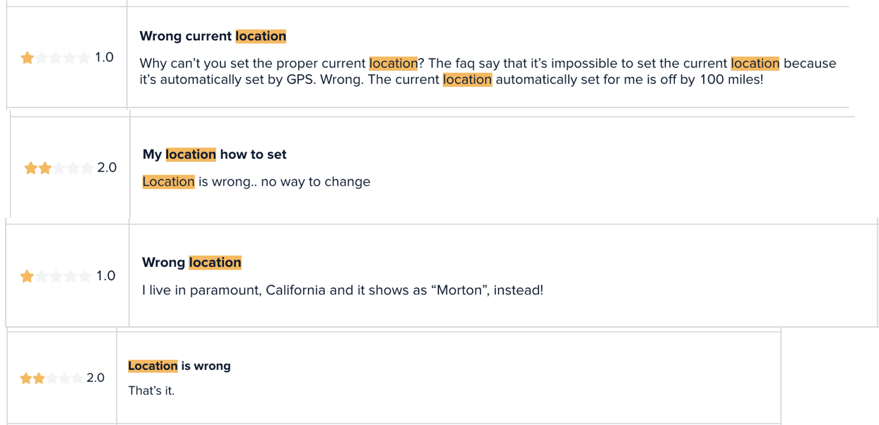
Looking at all the reviews with lower than a 3-star rating, I found some users didn't understand the side menu (search icon) functionality and that the GPS location isn't always working as expected. We treated these as additional discoveries to act on in the future, as they were not relevant to the goal of this story which was to improve the usability and affordability of how to switch locations within the app.
Design Critique Session
Once I had analysed existing patterns in the industry and looked at our reviews, I set out to create as many different variations as I could come up with. I then took 5 of these concepts to the Product Design team and I ran a Design Critique session.
At the time, this was the first session we ran with the team, as something new we wanted to try out so it was an interesting and fun experience.

Stakeholder Input Session
Concept 1 - moved the pagination control to the top
Concept 2 - made use of a custom design pagination control to make it stand out
Concept 3 - turns location pages into cards, if multiple locations are added on the first start following the update an animation is triggered otherwise it is triggered when the first new location is added


Based on my presentation, stakeholders appreciated the standout pagination and animation. Drawing from my experience, I highlighted how these changes would enhance affordability and help reach our goal. This was the first time we considered animation in any of our apps, but based on my input stakeholders wanted to combine the two concepts.
Animation Iterations
Based on stakeholder feedback, I iterated on the animation design using Protopie, refining the effects and speeds through multiple versions. My iterations focused on achieving the optimal balance of motion to enhance usability and affordability of the feature.
The first iteration I felt had too much bounce and too fast
The second iteration felt like it still had too much movement
The third was close but needed some small nuanced refinement. It felt slightly too slow and uniform in the animation.
Have a look at the three concepts for yourself!


Flow Diagram for Developer Handover
Leveraging my experience, I created a detailed flow diagram for developer handover. This included scenarios for both new and existing users to ensure clear and effective implementation of the design changes.
I believe that, the clearer you make the desired outcome, the smoother the implementation process will go, allowing you as a team to focus on the edge cases and quality of the final deliverable.
In the diagram, I considered two scenarios. One where the user is a brand new user, therefore doesn't have any locations added yet and a scenario for the behaviour towards users who already use the app.


Final Design
The final design solution, which I proposed and collaboratively implemented with the team, included :
Enhance the page controller's visibility and impact by incorporating some branding
A subtle nudge animation of the location
Both of which, aimed at improving the usability and discoverability of the location-swapping feature.

Impact & Retrospective
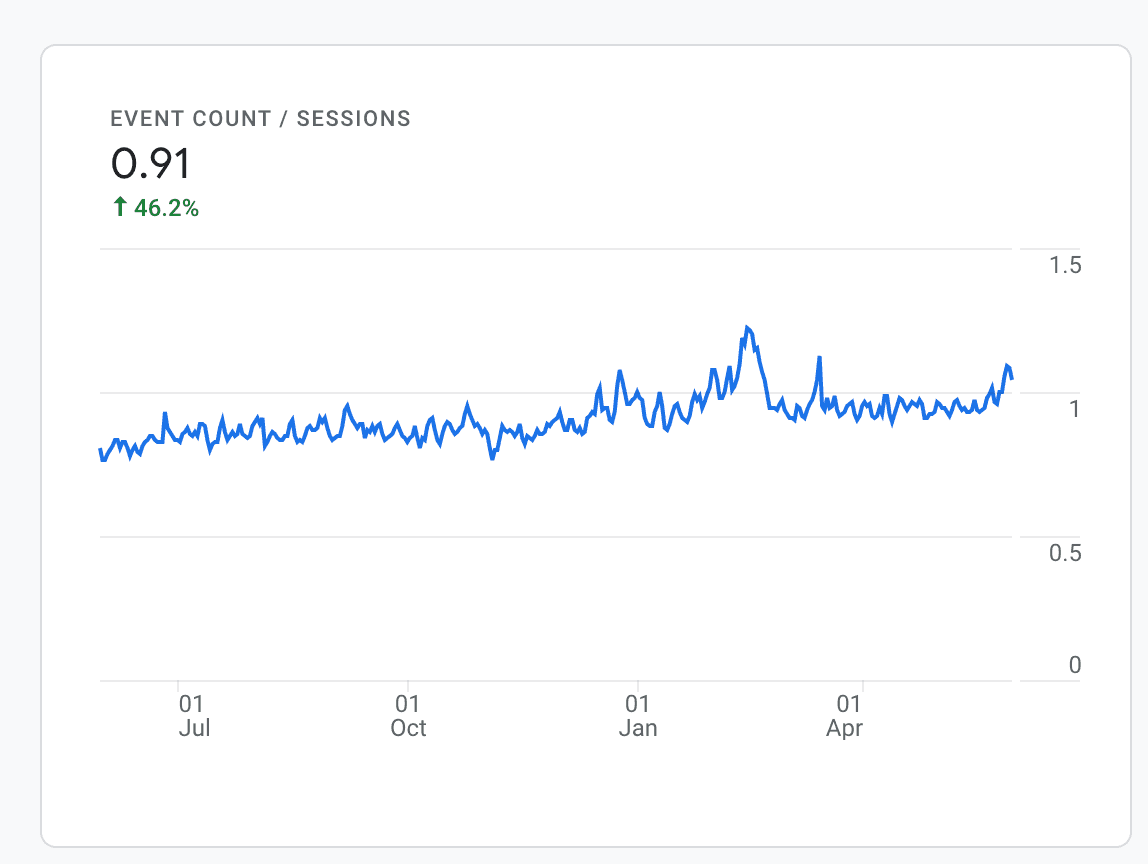
One of my biggest gripes and learnings with this improvement was that I don’t know the exact impact of it. I’m analytical and therefore a stickler for keeping track of the impact my work has. Although I left Impala Studios before the final impact data was available, anecdotal feedback from colleagues indicated that my changes successfully improved the swipe origin ratio and user engagement. What I do know for a fact, is that we managed to drive the usage of the swipe gesture to 85% from the prior 42%, resulting in a staggering 97,6% increase.
I also love the concept of design critique, as it brings out that spark and energy which is one of the greatest superpowers of having a larger design team. While I introduced the team to the concept of design critiques which proved valuable for our collaborative efforts, it felt slightly over the top for such a small improvement.
Lastly, given the context of Impala Studios having several weather apps, I would have loved to bring the learnings of this improvement into some of the other apps, where relevant.